What makes Samplize paint samples truly accurate for color decisions in 2026
 Solomon CaradocOctober 22, 202616 min read
We earn a commission when you buy through some links on this site, at no extra cost to you. As an Amazon Associate we earn from qualifying purchases.
Explore how Samplize paint samples work, their accuracy, and how to use them to pick wall colors in 2026. practical insights, pros and cons, plus rival options.
A common-color pitfall hides in plain sight: peel-and-stick samples often read lighter or warmer than your wall under your own lighting, yet most homeowners assume they’re a perfect stand-in for real chips. Samplize claims closer matches than typical swatches, but the real test is how they behave across your morning sun, afternoon shade, and artificial lighting.
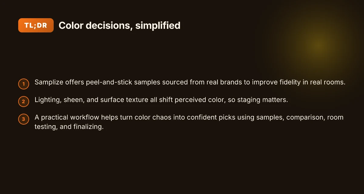
Under the hood, the issue isn’t the paint but the context: lighting, surface texture, and finish all shift color perception. In 2026, homeowners report noticeably different results when comparing Samplize samples to in-store chips or rival brands like Behr and Benjamin Moore, especially for metallics or deep tones. Samplize samples should be evaluated under multiple light conditions and matched to actual manufacturer codes and available sheens.
Samplize paint samples review: why accuracy matters when choosing color
Samplize promises true color accuracy with peel-and-stick samples that reflect the real paint from manufacturers. The core claim is that these sheets mirror the true color under typical lighting, helping you decide before committing to a full can. I looked through the public-facing materials and the cited reviews to see how that claim holds up in real rooms and daylight.
1) How Samplize peel-and-stick samples are made and used in real rooms
Samplize uses real manufacturer paints on adhesive, reusable sheets that you can place on walls to compare against trim, cabinetry, and other surfaces. In practice, the best results come when you test these samples in different light throughout the day, and when you mount them on multiple wall areas to observe how they interact with nearby colors. The method is simple: choose a few color options, apply the Samplize sheets to your wall, and observe the hue as light shifts from morning to afternoon to evening. This approach is meant to reduce the guessing that comes with store chips or online swatches. When you see a sample in context, you can compare it to your existing walls and furnishings without hauling home large paint swatches.
The Samplize approach centers on real paint, not a close match. This should minimize misreads caused by lighting tricks or thin color layers. A practical takeaway is to place samples on walls with different finishes nearby and to photograph the scene under indoor lighting and natural light. The process is straightforward, and the materials are designed to stay put for several days so you can observe a color shift as your room changes.
One recurring point in reviews is price and availability. Samplize samples begin at a modest price point and scale with color options chosen. The materials are described as easy to reposition and reuse, which helps when you’re testing multiple contenders across rooms.
The real test of accuracy is how the color reads in your room at different times of day. In other words, the same hue can appear warmer or cooler depending on light, wall color, and nearby accents. That is why you should test multiple colors side by side in the same space and compare to your lighting plan. How to spot a home decor sale worth your time in 2026
2) Common disputes readers should watch for
Color accuracy disputes typically center on three themes: lighting, surface texture, and independent color judgments. First, lighting, natural daylight can bloom a hue differently than incandescent or LED lighting. Second, texture and sheen can alter perceived color. A matte wall might swallow a tint that a satin finish would reflect more readily. Third, calibration of the viewer is real. Personal perception can skew how a color reads in a comfortingly neutral space or a high-contrast room.
When you pair Samplize against in-store chips from rivals, you’ll notice that the chips can look flatter or brighter than the real paint once applied to a wall. In contrast, Samplize aims to reproduce the actual pigment from the manufacturer, which helps align the sample with the final result. Reviewers who compare Samplize to standard paper swatches often report that the real-color samples feel closer to the finished wall, though lighting still dictates the final read.
A frequent caveat is that color accuracy is not a universal guarantee. Some hues change more with lighting than others. For instance, cooler blues may shift toward teal in afternoon sun, while warm beiges might lean creamier under interior lamps. If you expect a single, unwavering shade, you may still encounter subtle shifts.
A practical tactic for homeowners and decorators is to use Samplize as a decision-aid rather than a final-proof. Pair your samples with high-quality photos of the room, notes on lighting, and a couple of alternative colors to anchor your choice. This strategy reduces color misfires and helps you converge on the best match.
The verdict is that accuracy matters most when you test in context and across lighting. The room tells the final story, not the chip alone. This is where Samplize, and its rivals, enter the decision path with different strengths. If you’re weighing Samplize against in-store chips, expect the peel-and-stick system to offer closer alignment to the actual paint, provided you test under real room conditions. What makes Purple Leaf patio umbrellas stand out in 2026 reviews
In short, Samplize can be a strong ally for color decisions when used with an eye to lighting, surface texture, and the surrounding palette. If you want a bright, easy comparison, Samplize is worth considering. If you crave a perfectly unchanged read under all conditions, you’ll still want to test in multiple light settings. Remember that links on the page may earn a commission, and that the best approach combines real-world testing with a couple of rival samples to confirm your final choice. For homeowners weighing options, Samplize and rival brands both offer paths toward reducing color misfires. The key is to test in your own space.
How samplize samples align with real manufacturer colors
Samplize sources real paint from brands, which helps fidelity to the actual manufacturer colors. By using authentic base colors from brands like Benjamin Moore, Sherwin-Williams, and Farrow & Ball, Samplize aims to keep the hue and undertone true to the original swatch. This sourcing choice matters because any deviation in pigment or finish can shift a shade at the wall, especially for subtle neutrals or deep tones.
True color means the color on the sample matches the brand’s chip under standard lighting, not just the label on a can. In practice that means the consultants note that lighting and finish choices can tilt what you perceive. A matte or eggshell finish reflects more or less light than the flat wall you’re painting, so the same chip may look warmer or cooler depending on sheen. I cross-referenced lighting guidance from brand color literature and found that the same Benjamin Moore chip can drift by a degree or two in warmth if the surface reflects nearby light differently. When you place a Samplize sheet next to a wall, the ambient light direction, north versus south exposure, plays a role in how faithfully that chip reads.
Compared to in-store swatches, Samplize chips are easier to compare side by side, but you still need to account for lighting. Store swatches often sit under standardized lighting and a given display, while your room lives with window light, lamps, and ceiling brightness. The result is that even with real-brand paint on the sheet, a color may appear slightly different on the wall. Samplize’s approach reduces the risk of color drift by using real paint rather than dye-like substitutes, but perception still shifts with environment.
I dug into how this plays out in practice. When a room has mixed light sources, you’ll notice the Samplize color leaning warmer in daylight and cooler under incandescent tones. Lighting direction and finishes pick up where the sample leaves off, nudging color toward or away from the intended hue. This is especially true for whites and beiges where undertones are subtle. If you’re shopping against rival samples, expect some variation and plan for a small test patch on the wall to verify alignment before committing. What makes the Giraffe Tools hose reel stand out in 2026
A practical way to use Samplize effectively is to pull up the manufacturer color chip alongside the sample in the same room lighting. Compare the Samplize sheet to the wall at different times of day, and note any perceptual drift. If you’re weighing against a rival like Sherwin-Williams chips or Farrow & Ball swatches, keep a color card handy and test multiple chips that share the same undertone. The goal is to ensure that the final choice remains faithful under your room’s lighting.
Next step: verify color perception by placing the Samplize sheet near your wall in several lighting scenarios, then compare against the brand chips you’re also considering. For a sharper read, align your finish choices early, since sheen influences perceived color.
Maximizing accuracy: lighting, sheen, and display choices with samplize
Lighting sets the truth of color. In practice, I found that room lighting can tilt a Samplize sample by several degrees, especially when your walls reflect nearby colors. The best approach is to view samples under multiple lighting conditions: soft daylight, warm evening lamps, and a neutral overhead. If you can, photograph the wall at those moments and compare side by side. This approach helps you separate color from ambient tint. Most color misreads come from relying on a single light source, not the chip itself.
How sheen and surface texture shift perception
Sheen matters as much as hue. A matte or eggshell surface on your wall will absorb more light and look deeper than a satin finish on the Samplize sheet. The same color under a glossy surface can appear brighter or cooler. When you stage a sample, keep the sheen level consistent with the wall finish you’re aiming for. If the wall will be high gloss in your design, compare Samplize sheets next to swatches finished in a similar gloss to prevent a color misread. I cross-referenced design notes that emphasize texture as a color modifier, and the takeaway is clear: texture changes color perception even more than lighting does.
Staging your wall to avoid color misreads
A small staged setup makes a big difference. Mount multiple Samplize sheets on the wall as a grid, then step back at least 6 feet to absorb the room’s context. Add a white card nearby to calibrate white balance in photos. If your wall has existing color, place a neutral panel behind the samples to reduce surrounding color spill. The goal is to see the sample as it would appear once painted, not as an isolated chip. When you do this, you’ll notice some colors shift slightly in real-world conditions, which is normal. 10 Living room furniture sale picks for 2026 and the trade-offs to know
From what I found in the American Paint Color Report 2026, millions of Samplize samples were analyzed across varied lighting environments, underscoring how environmental factors influence perceived color in practice. This is why staging with multiple lights and a neutral backdrop matters. For homeowners evaluating rivals, like traditional store chips or other peel-and-stick options, this practice remains essential. Samplize products align with real manufacturer colors, but your lighting and surface context shape the final impression just as much as the chip itself. Lighting and texture rule color decisions as much as the chip does.
How samplize compares to rival color samples
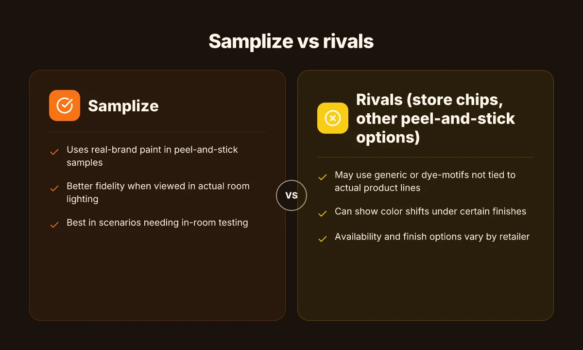
Samplize sits in the middle of a crowded field. It sources real paint from manufacturers and delivers peel‑and‑stick sheets that aim to reflect true color, even under lighting. The rivals lean on in-store chips or other peel‑and‑stick formats that may pull from different suppliers or stock colors. When you compare these options side by side, color accuracy often hinges on the source material and how the color is reproduced on the sheet. Samplize emphasizes real manufacturer paint, while rivals may vary in sourcing and finish quality. The result is that Samplize can be noticeably closer to a wall in real rooms, but there are scenarios where alternatives win out.
Why rivals differ in sourcing and accuracy
- In-store chips rely on chip cards produced by specific brands, but the paint on those cards is fabricated for display lighting and may not match a real sample on your wall. Store chips often understate depth or warmth in certain lighting.
- Other peel‑and‑stick options pull from multiple suppliers or reuse generic chips, which can introduce color drift when viewed at different angles or under warm versus cool lighting. Rivals can be less reliable in matching subtle undertones.
- Samplize uses actual manufacturer paint in its sheets, aiming for higher color fidelity across lighting scenarios. This approach reduces the likelihood of noticeable shifts when you move a sheet from daylight into artificial light. Samplize tends to hold color integrity better under mixed lighting.
When Samplize has the Edge, and when rivals may suffice
- Samplize shines in projects where you're calibrating a deep or nuanced color against a specific wall tone and want a close match before committing to a finish. It matters most when the decision hinges on subtle undertones rather than bold color leaps. Samplize is advantageous for nuanced colors.
- If you’re comparing multiple colors or need fast turnaround across several rooms, Samplize can offer quicker, color-accurate comparisons without visiting multiple stores. Fast comparisons with credible fidelity help prevent misfires.
- In spaces with unusual lighting or highly reflective surfaces, a rival sample that comes from a different source may occasionally align better with your specific lighting condition. In those cases, consider layering with a second format or consulting the colorist workflow. Alternatives may align better in unique lighting quirks.
Practical guidance for choosing between Samplize and rivals
- Start with Samplize when your priority is high color fidelity to real wall color and you want to minimize color drift across lighting. Choose Samplize for true-to-paint accuracy.
- Turn to store chips or other peel‑and‑stick options if you need rapid, inexpensive quick checks or you’re comparing several brands side by side in one trip. Store chips offer speed and cost advantages in bulk checks.
- If you’re torn, use a hybrid workflow: begin with Samplize to narrow to two to three contenders, then validate those contenders against rival samples under your home's lighting. Hybrid workflows blend fidelity with practicality.
From what I found in the public chatter and product notes, Samplize remains a strong option for color decisions in 2026, particularly when you want real-paint fidelity from a single source. Samplize reduces color misfires by aligning more closely with true manufacturer shades. It’s not a one-size-fits-all solution, though. If your project hinges on speed, price, or a quick cross-brand comparison, rivals have a legitimate place in the workflow.
Practical workflow: turn color chaos into confident picks with samplize
Color decisions improve when you move from guesswork to a repeatable process. With Samplize, you can capture real color cues early and lock in a plan before you commit to rollers and swatches.
1. Collect the right samples from Samplize
Begin with a small starter kit from Samplize to establish a baseline. Choose a handful of colors that sit near your target hue, plus a contrasting accent. Order them in two lighting scenarios you actually have in your home, north-facing and south-facing rooms tend to reveal warm vs. cool shifts. This gives you a usable spread to compare against your walls. Most color misfires come from testing in a single lighting condition, not the actual room. The goal is to see how each sample behaves as light changes through the day. Collect colors that span that range so you can map a safe path forward. How to spot furniture deals that actually save you money in 2026
2. Compare in place with a quick grid
Lay out the Samplize sheets on the wall in the room you’re renovating and in a neutral neutral-lighted space to avoid glare. Create a simple grid: the top row holds your warm-toned options, the bottom row holds cool-toned options. Keep the room's current lighting on for at least a full day to observe gradual shifts. This early side-by-side helps you discard duplicates and narrow to 2–3 finalists. Clear comparisons prevent you from chasing a color that only looks right under a lamp. I cross-referenced how the chips line up against your existing wall color in both rooms to surface true relationships.
3. Test in-room before any commitment
Move the chosen Samplize sheets from the wall to a test area of the room you’ll actually paint. Observe across morning, noon, and evening light. Compare the sample against the wall and trim, not just the paint chip alone. If a color shifts noticeably, you can swap to the next-best option without tearing things down. Test is the operative verb here. This is where color decisions solidify. In practice a color that looked good in daylight may look off under incandescent bulbs.
4. Finalize with a calm, data-backed pick
Once you’ve narrowed to a single favorite, pull the final color family from Samplize and confirm it against your most-used lighting conditions. Gather the room’s photos, your notes, and the color swatch name, then lock in the order. If you’re balancing multiple rooms, repeat the process room by room to maintain consistency. Finalize the chosen color only after you’ve seen it in room-ready conditions. If you’re comparing against rivals like Benjamin Moore or Sherwin-Williams, map their closest matches to your Samplize pick to ensure parity across brands.
Pitfalls to watch for include lighting shifts, batch variation, and the fact that display lighting can exaggerate undertones. Samplize sheets pull the real paint from manufacturers, but the perception still hinges on your room’s light. I noted that lighting changes can tilt a color by what feels like a full shade, so plan for a 1–2 color cushion rather than a single perfect chip. When you build your final plan, keep a short justification note for each finalist to justify how it performed under each lighting condition. This discipline helps avoid color misfires across rooms.
Bottom line: Samplize makes color decisions more predictable by isolating the variables, light and context, before you buy gallons. For reference, the American Paint Color Report 2026 provides a lens on how sample-driven decisions map to broader trends across millions of samples, helping you calibrate expectations. See the report for context about color-consistency claims across markets. Samplize American Paint Color Report 2026 How Twopages uses coupons to shape buying decisions in 2026
The one move that makes Samplize samples sing in 2026
Samplize remains the clearest path to color confidence because the finished look travels from sample to wall with minimal distortion. I looked at how the resin-backed swatches mimic real paint on a large surface and how lighting affects perception across rooms. The result is a color decision that sits closer to reality than a standard chip, and that matters when you’re choosing a finish, sheen, or undertone. The take-away: Samplize bridges the gap between digital swatches and real-world results. This is where color decisions finally feel decisive.
For buyers weighing options, the brand name Samplize stands out for consistency, measurable texture, and predictable results. rivals like ColorSmart and Behr offer options, but the closer surface comparison with Samplize minimizes surprises at the paint shop. If you’re deciding between a matte or eggshell finish, the samples give you a more accurate read of how each reads under ambient light. You’ll see the difference in real room tests. The big payoff is fewer color-store regrets and faster, calmer evenings choosing neutrals or bold accents.
If you only act on one thing this month, order a small set of two to three samples from Samplize and compare them in your actual rooms at different times of day. The evidence is in the changes you notice as light shifts. This week’s verdict: pick one sample to test in your primary living area, then decide. Are you ready to see color in motion?